|
The new Lancia logo, created by
RobilantAssociati, an advertising agency that specialises in
brand advisory and strategic design, and by the Lancia
Styling Centre, has been unveiled in Geneva this week.
It is a symbol of ‘change in continuity’, a sign of the past
reinterpreted in a modern key to convey the idea of a brand
projected towards the challenges of the future but also
proud of its historical identity. This makes the new Lancia
logo a visual synthesis of its philosophy of Tradition and
Innovation. The brand can boast a vast heritage, which is a
constant source of inspiration in its striving for
innovative technical solutions.
The new logo is essential and striking, and confirms its
strong links with Lancia tradition through two elements: the
colour blue, which has been present since 1911, and the
shield, which was added in 1929, but has been brought up to
date by the volumetric use of 3D. The most important
innovation regards the steering wheel, which becomes a
graphical sign, and the four spokes, which are now expressed
in two points and play a functional role: focusing the eye
on the Lancia logo, which has been slightly touched up to
make it more legible, but still maintains its graphical
links with the 1911 logo.
The new Lancia logo embodies the mission of an Italian
company that for a century has been building cars with
fascinating styling and innovative engineering, true icons
of our time that continue to amaze us for their design,
elegance and character. All this belongs to Lancia’s human
and technological heritage: this is where the uniqueness of
one of the most amazing adventures of the 20th century lies,
a story that began in Turin in the Autumn of 1906, one of
men, engines, roads and technology. But also of the symbols
that have appeared on the radiator grilles of Lancia cars in
the last one hundred years. A description of them follows,
with a reference to the year when each one was used for the
first time.
1907 – 1910
In 1907 a rectangular plate appeared on Lancia cars, which
is usually considered the first trademark. In fact it was
simply an identification plate, made of bronze, with the
company name ‘Lancia e C’, and the chassis number
underneath. We should point out that the typeface was
already very clear: a gracious Bodoni narrow upper case
(derived from the classic Roman) with a few changes,
including the cross-stroke of the ‘L’ which was extended to
underline the first ‘A’. In the same period, the Lancia
signature in Art Nouveau characters appeared on the water
radiator of some versions of the Alpha, Dialpha and Beta.
But even in this case, it was not a proper logo. In fact we
have to wait until 1910, when Vincenzo Lancia asked conte
Carlo Biscaretti di Ruffia to study the brand’s first proper
logo.
1911 – 1932
Conte Carlo Biscaretti di Ruffia proposed six watercolour
sketches, from which Vincenzo Lancia chose one that
reproduced a circular logo, created by the outline of a
steering wheel with four spokes (the manual accelerator
control is recognisable on one of them), drawn in gold on a
white background, under a blue flag hanging from a lance
with the company name in gold.
|
 |
|
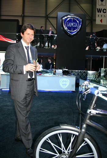
With the new Lancia
logo rising in the background, brand CEO Olivier
François inspects the innovative new Lancia bicycle
in Geneva. |
|
 |
|
The new Lancia logo, created by
RobilantAssociati, an advertising agency that
specialises in brand advisory and strategic design,
and by the Lancia Styling Centre, has been unveiled
in Geneva this week. |
|
|
 |
|
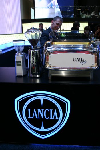
The new Lancia logo is
emblazoned on the "Lancia Café" in Geneva.
It is a symbol of ‘change in continuity’, a sign of the
past reinterpreted in a modern key. |
|
|
The first car to sport the logo in 1911 was the Gamma 20HP,
followed by the Delta, Epsilon, Zeta, Eta, Theta, Kappa,
Dikappa, Trikappa and Lambda. The last series of the Lambda
kept the circular logo alive until 1932, although from 1929,
with the launch of the Dilambda, all the other models
adopted a new logo, except for the first series of the
Artena, Astura and Augusta.
1929 – 1957
The Dilambda was launched in 1929 and Vincenzo Lancia
decided that this car should be the first to carry a new
logo. The choice went to another of the original six
proposals by Carlo Biscaretti di Ruffia: a shield with a
blue background, contained in a light double white surround
that framed the previous circular emblem, on which only the
graphical representation of the manual accelerator was
modified. This logo was used until 1958 on the Dilambda,
Artena, Astura, Augusta, Aprilia, Ardea, Aurelia and Appia
(first and second series). We should point out that the
first model to use this logo continuously was the Aprilia,
from 1936, while the Aurelia and Appia were the last to do
so, in 1958.
1956 - 1979
In 1956 a prototype Flaminia was presented at the Turin
Motor Show; it was designed by Pinin Farina and sported the
new, more stylised trademark at the middle of the front
ventilation grille, since the traditional radiator grille
had been eliminated. The shield and the steering wheel
(without spokes) had become two simple chromed metal
profiles, on which were applied the flag with an enamelled
blue background and the chromed logo; the characters were
also narrower and taller. This new logo was used until 1980
on the front of the Flaminia, Appia (third series), Flavia,
Fulvia, Beta (first and second series), Gamma (first series)
and Beta Montecarlo (first series and Scorpion). The only
exceptions were the Stratos, which sported a perforated
circle and the flag without the shield, the Sport and Zagato
versions of the Fulvia and Flavia, which had the shield and
a circle, both of which were full and enamelled, and finally
the Lancia 2000, which returned to the circular logo
designed by Carlo Biscaretti di Ruffia with the changes
introduced in the early 1930s.
1979 - 2006
In 1974, Lancia Chairman Umberto Agnelli asked Massimo
Vignelli, an architect from Milan, to review Lancia’s
coordinated image, creating a new logo to be used with
different materials and uses. The result was a proper
‘technical drawing’ of the symbol, which established the
guidelines for its application, the exact dimensions and the
correct ratios between all the stylistic and graphical
elements (outlines, backgrounds and colours).
The end result was a sketched logo with a blue shield and
white circle, which revived four of the five elements of the
1936 trademark (wording, steering wheel, flagpole and flag,
but without the accelerator control), making some
significant changes. For example, the wording was made
simpler, without any graphic frills, and the typeface was
less narrow but taller, while the horizontal stroke of the
‘L’ was in line with the base of the logo. The pole was also
shorter, without the ropes and the point became a
well-defined triangle. The spokes returned on the steering
wheel (now white and blue), but without the outline of the
manual accelerator control on the right spoke; the graphical
sign of these elements was much more marked. And finally,
the shield, the circle and the drawings of the
steering-wheel and flag had delicate silvery metallic
outlines; the same material was used for the Lancia name.
The first car to adopt this new logo was the Delta in 1979,
and it has since appeared on the front of all the cars
launched in recent years, whether for the road or for
racing: from the Beta Montecarlo (second series) to the last
Gamma and Beta, the Trevi, Delta, Prisma, Rally 037, LC1,
Thema, Dedra and Z, right up to the current Lancia range.
The shield has not undergone significant changes since then,
except in its size and for the fact that the frame has
become chromed.
|
|
|
|