In recent
months, the Fiat brand has implemented a new strategy, which
is underlined by the many new products that have been
presented: from the Croma to the Grande Punto, the Panda and
the Fiat Sedici, and they will soon be joined by the new
Bravo. As Luca De Meo, President of the Fiat Brand,
explained, “In this important, dynamic context, we have
decided to acknowledge the progress achieved so far, by
changing our logo, as a tangible sign of the new impetus
that is projecting us towards future challenges. This is why
the new logo will make its debut on the front of the new
Bravo, before being gradually adopted on all Fiat models."
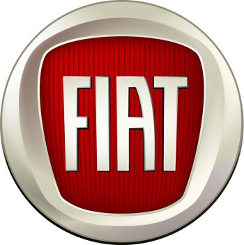
Created jointly
by RobilantAssociati (an agency specialising in Brand
Advisors & Strategic Design) and the Fiat Style Centre, the
new symbol is derived from the famous shield that decorated
the front of Fiat cars from 1931 to 1968, with the
vertically elongated letters of the word ‘FIAT’ standing out
against a ruby red background, encased in a chromed round
frame. It has a three-dimensional effect which conveys an
idea of technology, Italian design, dynamism and a strong
personality, while it also harks back to the round logo
(white wording against a red background, surrounded by
laurel leaves) that identified powerful, high performance
Fiat models for many years.
The essential,
strong new logo therefore conveys ‘ongoing change’, a sign
of the past re-read in a modern key which is particularly
representative of Fiat today, a brand projected towards the
challenges of the future but also proud of its historical
identity.